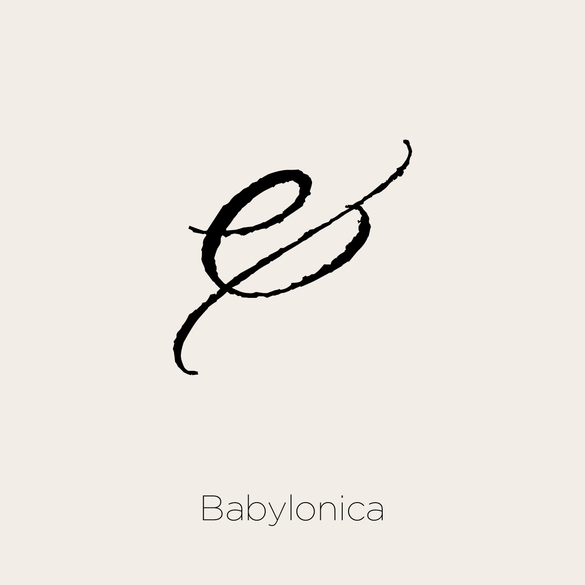
Ode to the Ampersand
It’s no secret I love typography. I study typefaces and have a passion for them. But if I had to choose one character that is my favorite, it would be the ampersand.
Typographers have always taken liberties and exercised creativity when designing the ampersand. It can be useful to identify an entire character set because it is typically one of the the most unique and recognizable characters in a typeface. I like to think of it as the essence, or even the “logo” for the character set.
Interesting facts about the ampersand:
It originated as a ligature of the letters ‘e’ and ‘t’ — Latin for ‘and’
One of the earliest know examples was found as graffiti on a wall in Pompeii, preserved by the eruption of Vesuvius in 79AD
The name ‘ampersand’ is first seen in use around the late 18th century. It comes from an alteration of and per se and (literally ‘and (i.e. &) by itself makes the word and’), which was repeated by schoolchildren to help them learn the symbol.
Beyond the intrinsic beauty and the artistic license the ampersand embodies, to me the ampersand represents some things I strive to include in all my work:
Connection: Bridge concepts and ideas to facilitate understanding
Simplicity: We live in a cluttered world — always look for ways to simplify messages rather than add to the noise
Brevity: So many messages compete for our attention — keep it short and sweet to reach your audience


